When we talk with colleagues in anticipation of attending a talk, we say "I'm looking forward to hearing her talk. I hear that she has collected an impressive dataset on wombat nose lengths." We don't say "I'm looking forward to reading all the material in her slides. I am especially eager to trust implicitly her over-simplified data slides."
A talk provides a special opportunity that is not available when reading a paper. We get to hear directly from the scientist their motivation for the work and to be guided through potentially complex datasets to the key discoveries. Remember, a talk is the beginning of a conversation. The conversation should continue in the question-and-answer period and, hopefully, long after. But, it begins with you and, especially, with your data. The audience wants to engage deeply with your data. Showing your data in some detail is one of the most effective ways of engaging a science audience in your work.
Unfortunately, science figures usually show only the central tendency (often the mean or the median) of data plus some measure of the variability. There are two problems with this presentation of data. First, it communicates little information. It is often faster, and no less informative, simply to say "We found that treatment A generated a highly significant increase in wombat nose sizes compared with treatment B" than to show the mean and error bars with some cryptic indication of "significance" for the two treatments. Second, this reduced representation of the data is an opportunity lost. When you show the data that underly the summary statistics, you provide an opportunity to engage the audience. Plots that show all the data allow the audience to intuitively grasp the sample size, the extent of variability in the experiment and the distribution of this variation. In the plots below, for example, the summary statistics (mean ± SD) hide the fact that the data were sampled from populations with different distributions.
Showing the data allows the audience members to do what they like to do, which is to be scientists who evaluate data. This will both keep them engaged with your talk and bolster their confidence in your work.
There is an entire hornet's nest of problems with the visual display of results as simply the mean plus or minus some measure of error. These problems extend to papers as well as talks. First, let's deal with the error bars. Very often in talks, speakers provide no indication of what the error bars represent. In neurobiology, where I am a recent interloper, speakers are particularly egregious. Over the past four years, I can't remember hearing a single speaker indicating, either in speech or in text on the slide, what the error bars represented. I look at the bars and I think "Well, I've done behavior experiments and there is no way that they are showing me the standard deviation of the data, so those must be standard errors." Once I figure out that I am looking at standard errors of the mean, I scan the slide trying to find the sample size, so that I can try to back-calculate, on the fly, what the standard deviation should look like. (As you all know, the standard error is the standard deviation divided by the square root of the sample size. Therefore, the standard error, unlike the standard deviation, decreases systematically with increasing sample size. So, if I can just find the sample size, I have some hope of estimating the standard deviation, which I use to get a feel for the variability of the experimental treatment.) But, I almost never find the sample size on the slide and I am therefore stuck taking a huge leap of faith that what the speaker is telling me is true, because it is very challenging to divine from the slide whether the data supports their statements. It is at this point, if I haven't already been hopelessly confused by the speaker, that I stop listening and start thinking about something else. I once read on Twitter—from someone that I don't recall confiding in—the following tweet: "Rumor has it that David Stern stops listening if you use the standard error of the mean in a scientific talk." I don't think I've told many people this factoid about me, so I was shocked (and pleased) to learn that my peevishness about standard errors was gaining attention.
What, really, is the problem with the standard error? Well, fundamentally, of course, there is nothing wrong with the standard error. It is a perfectly valid way to estimate the confidence in your estimate of the mean. If you have come up with a new way to estimate the melting point of water, then you definitely want to report your estimate along with the standard error, so that we can all understand how much error there may be in your estimate. The problem is that the standard error is often used to represent the variability in an experiment (not in an estimate of the central tendency), so that a "simple" visual comparison can be made with controls and other experimental results. Use of the standard error of the mean in this context is really a bit of visual trickery and can be extremely misleading. Remember, to test whether two results are "significantly different," we usually compare the difference in the means of the data from each treatment with the variability in the experimental treatments, usually measured as the variance (which is the standard deviation squared). For most experiments, it is therefore far more intuitive to give the observer a sense of the variability in the treatments (standard deviation) than a sense of the variability in the means (standard error). Showing the standard deviation allows observers to quickly and properly interrogate the data and come to their own conclusions about the results. Using the standard deviation (and eschewing the standard error) is really only a half solution, however. It is far better to actually show all the data that underlie the estimates of the mean and standard deviation together with estimates of the mean and standard deviation. During a talk, this has the huge advantage of engaging the audience in a deep way with your data.
Observers with experience looking at data (i.e. scientists) can usually intuit whether two samples look like they have come from samples with different means, which is usually what statistics are used to infer. Thus, in talks, it often becomes unnecessary to report the details of the statistics. You can say, if you like, whether results are "statistically significant," but this quickly becomes pointless when it is obvious that two samples with reasonable sample sizes have different means.
Finally, it really is just as easy to plot all the data as it is to generate any other kind plot. Often, I plot the raw data together with the mean and standard deviation. It is easy, then, for the observer to see both the raw data that underly the conclusion and the central tendency of the data. Many plotting programs, including the powerful plotting routines available in the free statistics package R, provide sophisticated methods for plotting all the data. For many experiments, the routines available on the BoxPlotR web server will suffice.
Here is an example from a great recent paper. Tenaillon and colleagues plotted one summary of their results as bar graphs with standard errors, which you can see on the left (or on top, if you are reading on your phone). In a review I wrote that highlighted their work, I re-plotted their data, which you can see on the right (or bottom on your phone).
I plotted all the data with random horizontal jitter for four of the categories, along with the mean and standard deviation beside each cloud of points. The re-plotted data provide a more intuitive presentation of their experimental results (with the exception of the background shading, which imparts no information and was added by the journal).
In some cases, when you have a lot of data, showing all the data may obscure interesting results. This can often be solved by altering the way individual points are represented. In this example, in an interesting paper by Cooper et al. the raw data were plotted (yay!), as shown on the left (top), but each point was small and uniformly black, which obscured the differences in data density in different regions of the plot. When I re-plotted these data for my book, seen on the right (bottom), I made each point larger and transparent, which allows the reader to see more easily that a huge fraction of the data have a relative fitness of 1, producing a trend that does not agree entirely with the regression.
Plotting raw data together with summary statistics also provides a more intuitive understanding of how the data generated the summary statistics. In this second figure from the Tenaillon paper, I fused their plots of the raw data and summary stats (on the top) into a single figure (on the bottom). To clarify the distribution of the data, I reduced the size of each data point and the thickness of the checkerboard lines, which attract more attention than they deserve in the original plots. I now feel like I have a more intuitive grasp of the support for the summary statistics, which are shown as shades of color.
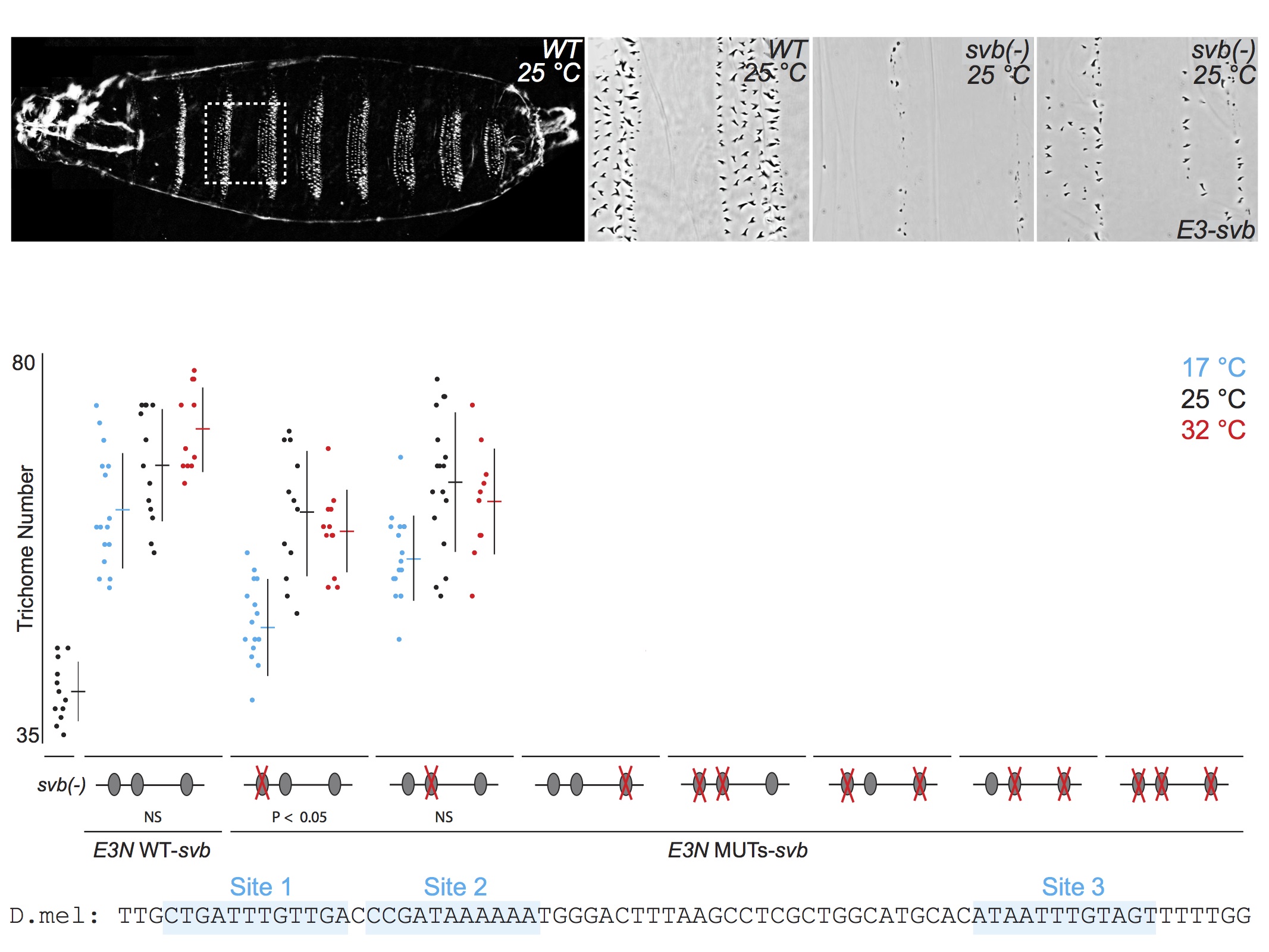
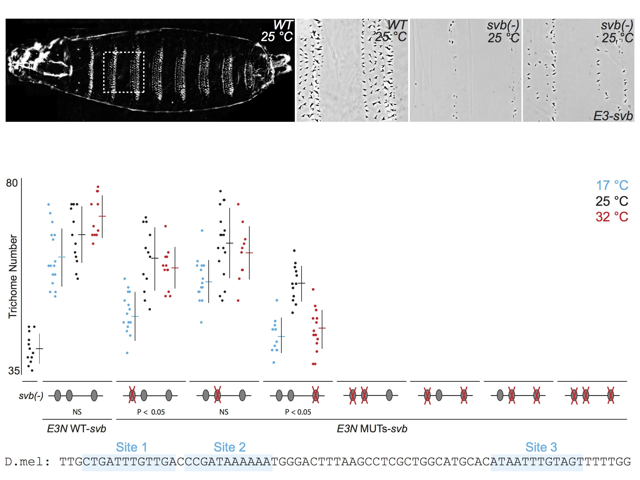
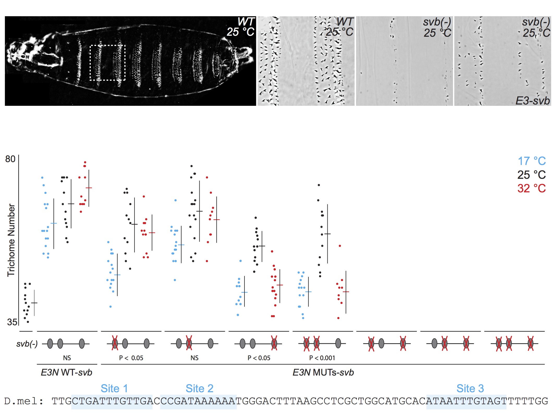
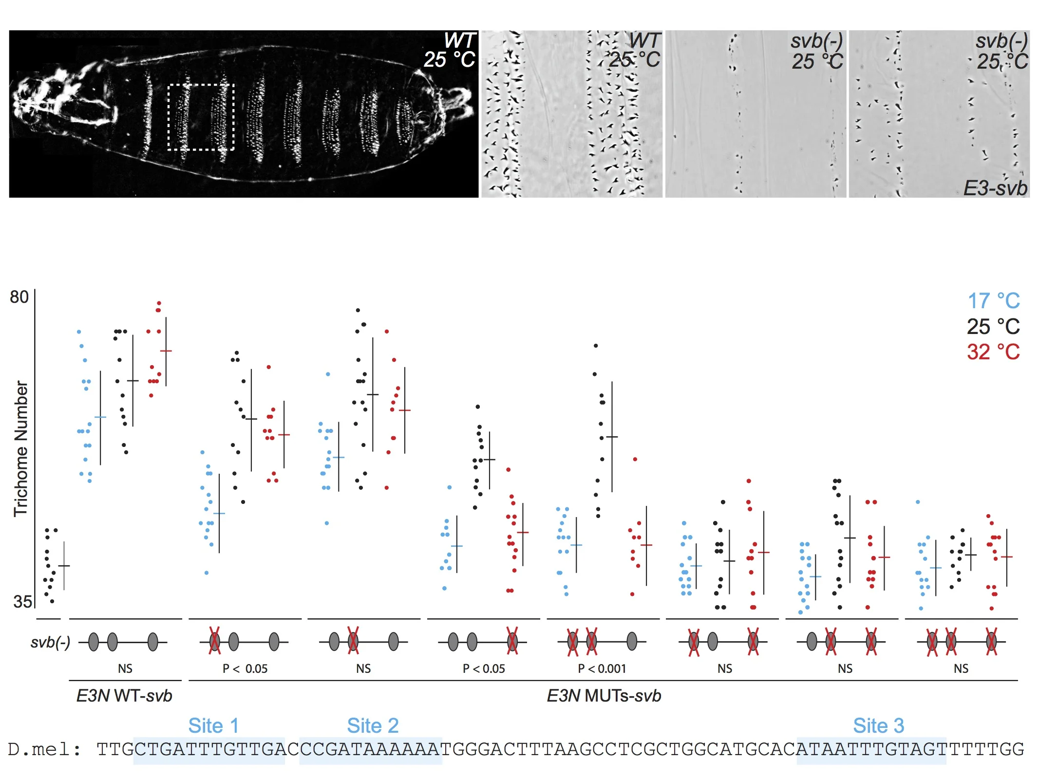
For talks, when I present the quantitative data from multiple related experiments, I often include the data on the same "slide," but I rarely flash up all the data at one time. First, I introduce each experiment, then I reveal the relevant data. This allows the audience to follow the logic of each experiment and to engage in the data. Here is an example of five consecutive views of a slide from one of my current talks. First, I tell the audience what they see in the panels along the top, then I walk them through groups of relevant experimental results. If I had simply flashed up all the data and said "Here you can see that multiple binding sites confer robustness against temperature variation" and then moved quickly to the next slide, probably nobody would have time to digest the mass of data to convince themselves that this is in fact true. By breaking up the data, I force the audience to focus on each subset of the data as I discuss it. They "analyze" the data as they see it and they "discover" the result for themselves.

When you show all the data you are illustrating your results much in the way that most scientists engage with their own data. They are a smart crowd and they will not be overwhelmed by all the data. On the contrary, they will be flattered that you have entrusted them with a genuine view of your science.
Postscript: While I was preparing this post, Weissgerber et al. published a useful paper that promotes plotting all the data and they discuss the many reasons that this is advantageous. I wholeheartedly endorse their conclusions and believe that showing all the data is likely to reduce publication of questionable results, as I discussed for a special blog post I wrote for BMC to accompany a paper I published on a not-unrelated topic in BMC Biology.